Responsive Website Design in Kolkata | A3 Digital
Responsive Website Design in Kolkata: How Mobile-First Websites Are Transforming Bengal’s Business Landscape
Kolkata is a city of contradictions that somehow resolves into coherence. Ancient tramlines and gleaming metro extensions. Classic addas in College Street coffee houses and startup pitch sessions in Salt Lake’s co-working spaces. The oldest stock exchange in Asia and some of Bengal’s most innovative fintech startups. This layered complexity is precisely why Kolkata’s businesses — from the iconic sweet shops of Bhowanipore to the trading houses of Burrabazar, from the jute mills of Howrah to the IT parks of Sector V — each need a website strategy as nuanced as the city itself.
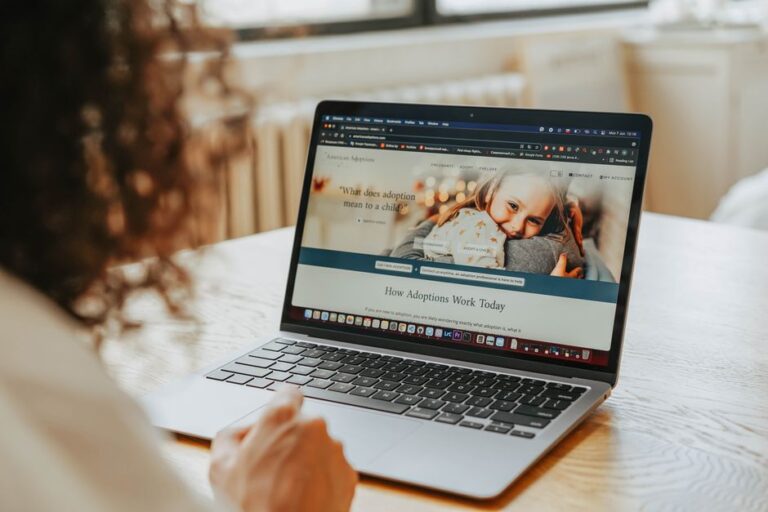
But despite all the sophistication, one principle applies universally across every Kolkata business and every customer segment: the first touchpoint is almost certainly a smartphone. Whether a Park Street restaurant customer is searching for a table, a Kolkata manufacturer’s buyer is researching a supplier, or a coaching student’s parent is evaluating institutes in Jadavpur — the device in their hand is what initiates the journey.
This is why responsive website design in Kolkata is not simply a feature or an upgrade — it is the bare minimum standard for any website that aims to capture and convert Kolkata’s online audience in 2026.
Understanding Responsive Design: What It Actually Means for Your Kolkata Business
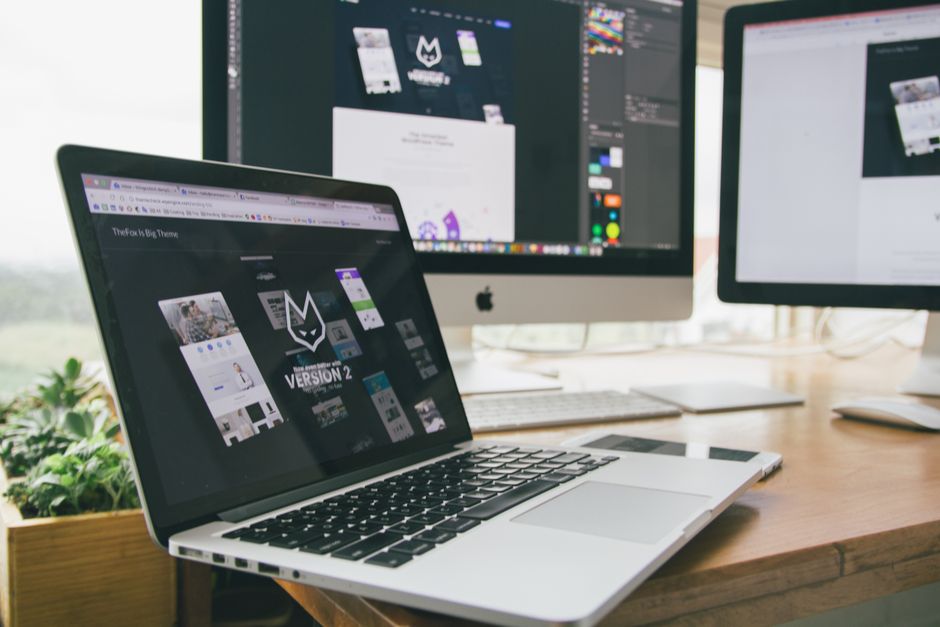
Responsive website design is one of those technical terms that gets used frequently and understood rarely. Let us be precise about what it means and — more importantly — what the difference is between a genuinely responsive website and one that merely claims to be.
A truly responsive website is designed from the ground up to deliver an optimal experience on every screen size — from a 5-inch Android phone to a 27-inch desktop monitor. This means layouts that reflow intelligently, images that resize without losing quality, navigation that transforms into a mobile-friendly menu, buttons that are large enough to tap with a thumb, and text that remains readable without pinching and zooming.
The critical distinction that most Kolkata web designers do not explain clearly: there is a significant difference between a responsive website and a mobile-friendly website. A mobile-friendly site is designed for desktop and then scaled down for mobile — often crudely, with elements that become too small to use or pages that require horizontal scrolling. A truly responsive site — built mobile-first — is designed for the smallest screen first, then progressively enhanced for larger screens. The result is dramatically better usability, faster loading on mobile, and significantly higher Google rankings.
Why Kolkata’s Market Specifically Demands Mobile-First Design
Kolkata’s smartphone penetration statistics tell a story that every Kolkata business owner needs to understand. Over 74% of Kolkata’s internet traffic now originates from mobile devices. In areas like Behala, Barasat, Dum Dum, and Howrah — where smartphone adoption has surged over the past four years — that figure is even higher.
This means that when a Kolkata customer discovers your business, they are almost certainly doing so on a phone. If your website delivers a poor mobile experience — slow loading, tiny text, difficult navigation — you lose that customer before they ever engage with your actual business offering. And you likely never know it happened.
Kolkata’s specific user behaviour adds another layer: the city’s residents tend to research extensively before purchasing. A Kolkata consumer evaluating a product or service will visit your website multiple times, compare it with competitors, and only then make contact. Each of those visits is likely on mobile. A poor mobile experience does not just lose the immediate visit — it removes you from the consideration set entirely.
The Five Pillars of Responsive Design We Build Into Every Kolkata Website
1. Fluid Grid Layouts
Traditional websites use fixed pixel dimensions — a container that is 1200 pixels wide, columns that are 300 pixels each. On a 400-pixel mobile screen, this breaks catastrophically. A fluid grid uses percentage-based dimensions that automatically resize to fill the available screen width — meaning the layout adapts gracefully to every device without breaking.
2. Flexible Images and Media
Images that look sharp on a desktop at 1200 pixels wide become pixelated and ugly if simply scaled down. We use modern image techniques — CSS max-width properties, srcset attributes that serve different image sizes to different devices, and WebP format for optimal compression — to ensure your images are crisp and fast-loading on every device from the latest iPhone to a mid-range Redmi.
3. Touch-Optimised Navigation
Desktop websites use hover states and small dropdown menus designed for precise mouse clicks. Mobile users have thumbs, not cursors. We design navigation specifically for touch interaction — hamburger menus that open smoothly, menu items with adequate tap targets (minimum 44×44 pixels), swipe gestures for galleries and sliders, and CTAs positioned for easy thumb access in the lower portion of the screen.
4. Mobile-First Typography
Text sizing that works perfectly on desktop often becomes unreadably small on mobile, or requires uncomfortable zooming. We establish a mobile-first typographic scale — base font size, line height, heading hierarchy — designed for comfortable reading on a 6-inch screen, then scale up elegantly for larger displays.
5. Performance Optimisation for Mobile Networks
Kolkata’s mobile network speeds vary significantly across neighbourhoods. While Salt Lake and New Town enjoy fast 4G, areas of North Kolkata and Howrah can experience slower connections. We optimise every site for performance on slower networks — through lazy loading, compressed assets, and deferred non-critical scripts — ensuring your website is usable by customers regardless of their connection speed.
Get Your Responsive Website Design in Kolkata — Starting ₹10,000
Free consultation · 7-day delivery · No hidden charges · 500+ businesses served
Response within 2 hours · Mon–Sat 9am–8pm IST
Responsive Design for Kolkata’s Key Business Sectors
Education and Coaching Institutes
Kolkata is one of India’s most education-intensive cities. From the coaching corridors of Ultadanga to the tutorial hubs of Behala, education businesses serve a customer base — students and parents — who research heavily on mobile before making enrolment decisions. A responsive website with course listing pages, fee structures, faculty profiles, result showcases, and a mobile-optimised admission enquiry form can transform a coaching centre’s enquiry volume within 90 days of launch.
Restaurants and Food Businesses
Kolkata’s food culture is legendary, and its dining scene is increasingly driven by online discovery. A restaurant on Park Street, a mishti doi seller in Bhowanipore, a wedding caterer in Salt Lake — all depend on Google searches initiated on mobile phones. A responsive website with a beautiful menu display, reservation form, photo gallery, and Google Maps integration is the difference between being found and being invisible.
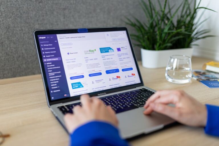
Trading and Distribution Companies
Kolkata’s trading community — particularly in the commodities, textile, and FMCG sectors — is experiencing a generational shift as younger procurement managers replace traditional buyers. These new buyers research suppliers on mobile before making calls. A responsive B2B website with product catalogues, specification sheets, and enquiry forms can open national distribution opportunities for Kolkata trading houses that previously relied entirely on personal relationships.
Healthcare and Diagnostic Services
Kolkata’s private healthcare sector is growing rapidly. Patients research clinics, doctors, and diagnostic centres online before booking appointments. A responsive healthcare website with doctor profiles, service lists, appointment booking, and transparent pricing builds the trust that converts a Google search into a confirmed patient visit.
Common Responsive Design Mistakes We Fix in Kolkata Websites
When businesses come to us after a previous web designer’s work, we consistently see the same responsive design failures that are silently costing them customers every day:
- Content hidden on mobile: Entire sections — testimonials, product specifications, team profiles — removed on mobile screens in an attempt to “simplify” the mobile experience. This is almost always the wrong approach.
- Pop-ups that cover the full mobile screen: Google penalises intrusive interstitials on mobile. Pop-up newsletter signups that are manageable on desktop become unusable — and ranking-damaging — on mobile.
- WhatsApp buttons that don’t open WhatsApp: A WhatsApp link on desktop opens the web version; on mobile, it should open the WhatsApp app directly. Most Kolkata websites get this wrong, losing the most valuable conversion action on mobile.
- Embedded Google Maps that freeze mobile browsing: Improperly configured map embeds can freeze the mobile page scroll — a terrible user experience that sends visitors away. We use lazy-loaded maps that don’t affect page performance.
Get Your Responsive Website in Kolkata — Starting ₹10,000
Free consultation · 7-day delivery · No hidden charges · 500+ businesses served
Response within 2 hours · Mon–Sat 9am–8pm IST
Frequently Asked Questions
Founder of A3 Digital Services. 17 years of web design & digital marketing experience. Built 500+ websites for businesses across India and internationally.
Keep Reading

Leave a Reply